Polymorph
The challenge
Polymorph is a machine learning-driven revenue optimization platform. Polymorph technology powers monetization for thousands of sites and apps, helping publishers like Politico, Edmodo, Viber and Axios maximize revenue across various revenue streams.
I was initially brought in to work on product design, but throughout my contract, I also helped with branding and marketing.
Team
Designer (me), 2 software engineers, marketing director, VP engineering, client success director, co-founder
Scope
Branding, IA, screen flows, product design, ensuring correct design implementation
Tools
Pen and paper, Sketch, Illustrator, Photoshop, Invision, Zeplin
Identity design
When I joined, the company was called AdsNative, but while I was there the name changed to Polymorph. The company needed a new visual identity. To highlight the fact that the ad experiences are highly-adaptable to their environment (native, banner, and email ads), I incorporated a twist in the letter P. Since this was not a reinvention of the brand, I brought in the previous color scheme to help smooth the transition.


UX and UI design
The product is pretty complex, so the learning curve was steep. However, the team was fantastic in helping me understand the intricacies of use cases. First thing I did was interview all of the stakeholders to get a better understanding of user types, obstacles in product development, as well as the overall direction of the product and what issues were the top priority. This helped me to dive into product design and start working with the engineers.
The previous designer had little contact with the developers. This definitely needed to change, so I set up weekly check-ins with the engineers to work out any design implementation questions they might have, as well as a weekly check-ins with the VP of Mobile Engineering to work on the bigger picture questions. All of the front-end engineering is handled by the India team, so most of the conversations and iterations were done online or over phone.
I worked on a series of small and large product changes: from modifying and re-designing existing flows, to creating new features and removing existing roadblock for customers.
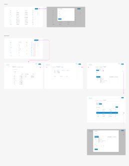
One of the key advantages of Polymorph is the clients’ ability to pick and choose which parts of the product they need to use. The product is then tailored to the clients’ specific needs. To allow for this type of customization, most of the product’s pieces are modular. This is also reflected in the design of the product: it is broken down into smaller chunks, like tabs that are reconfigurable.
Here is one of the screens in the Network Campaign flow that I have created. One of my bigger recommendations was to move away from treating the top-level steps as tabs, since the users cannot jump between the section without going through the steps sequentially. This is a bigger issue that involves multiple engineering teams, so it is currently under construction. The image below shows the present state of the product.
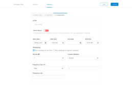
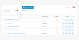
Campaign search was one of the features that users really wanted to see. Here is a proposed design treatment for advanced campaign search. After discussing this route with the director of client engineering, we decided to go for a filter instead.
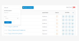
This is the filter design. It addresses the current use case: allowing simple filtering based on the values in the columns.
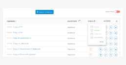
This is the next phase of filters. It would allow filtering based on more complex, backend properties. For example: only showing campaigns that have crossed the 90% completion mark. This iteration is under development.
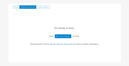
View of the Exchange tab’s content when nothing has been added yet. It used to be completely blank, so I added a prompt for users to create a new campaign.
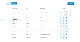
After a new network is added, it could take up to a few minutes for it to become active. During that time, we are running some operations in the background (like fetching tags), so the network is not available. To indicate this to the users, the new network’s row is greyed out, is not clickable, and displays a tooltip on hover.
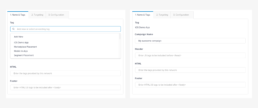
On the left: the user adds a tag for the campaign from a dropdown list (with an option to create a new one). On the right: once the tag is chosen/created, the user can no longer change or edit the tag. It is now tied to that specific campaign.
The result
The thing I loved the most about working with Polymorph was the fact that the team was pretty small and agile, which allowed for fast decision-making and turnaround time, as well as the company’s overall openness to exploring different avenues for the product.
Other Case Studies
Product and visual design for a B2B2C health insurance platform
Product design for an enterprise-level SaaS business
Redesigning the giving experience for University of California, Berkeley
iOS and Android app design for a transportation startup
