UC Berkeley
The challenge
Give.berkeley.edu is Berkeley’s giving platform.
We are redesigning the experience to better reflect the needs of our growing donor base, to bring the gift processing in-house, and to fix a few big roadblocks.
The goals for the 2.0 version are:
- Allowing donors to give to multiple funds in one transaction
- Ability to enter amounts and edit the selected funds within the same UI
- Minimize distractions that interrupt the completion of the giving process
I am responsible for generating designs, user testing, presenting my recommendations to the stakeholders, gathering feedback, and adjusting the designs based on that feedback.
Team
Designer (me), backend engineers, frontend engineer, project manager, digital media director, art director
Scope
IA, wireframing, task flows, pitching solutions to stakeholders, conducting user testing, product design, ensuring correct design implementation
Tools
Pen and paper, Sketch, Invision
Giving gifts vs buying things
While the concept of a shopping cart is familiar to many users, we are deliberately trying to avoid the feeling of an e-commerce experience. As a part of it, we are changing some of the semantics to better reflect the fact that the donors are giving gifts: using “gift basket” instead of “shopping cart”, and “proceed to gift details” instead of “proceed to checkout”.
Giving basket experience
We are introducing a persistent UI element in the form of a giving basket. The goal of this basket is to allow donors to quickly view what they have already selected, edit the selection, search and add funds without leaving the basket.
Below are the three possible treatments I am exploring:
Tooltip
This is one of the more compact treatments.
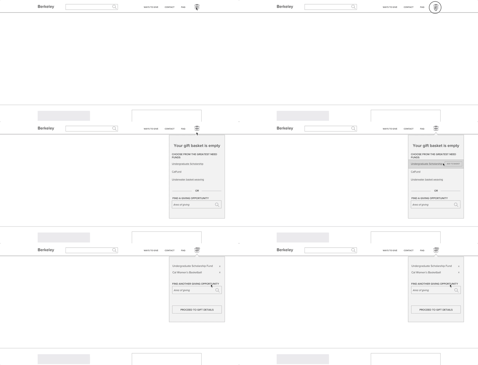
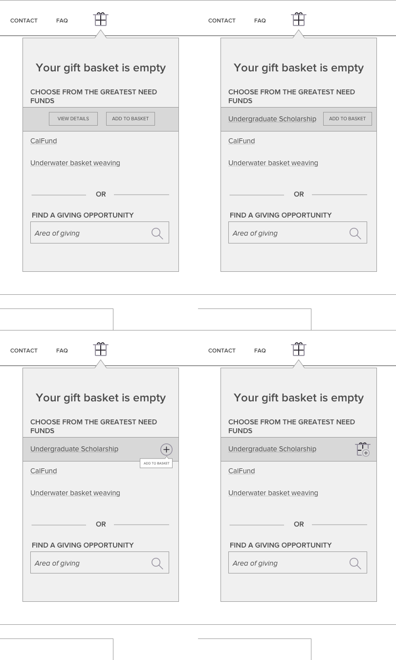
While it is less invasive, it does present the challenge of having very limited space to display all of the information. Specifically, when trying to add a fund to the basket. Here are a few options for the treatment of the Add to Basket button.
Drawer
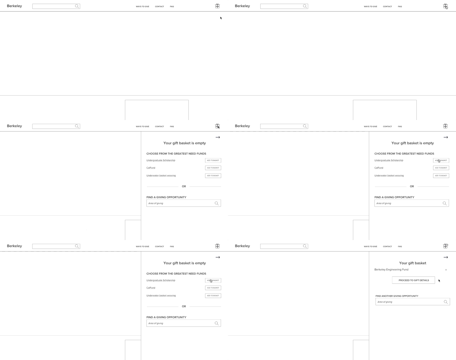
This is the treatment that I think has the most potential. It provides enough room for all of the information to fit in it, while also allowing for the information underneath it to remain visible.
Sidebar
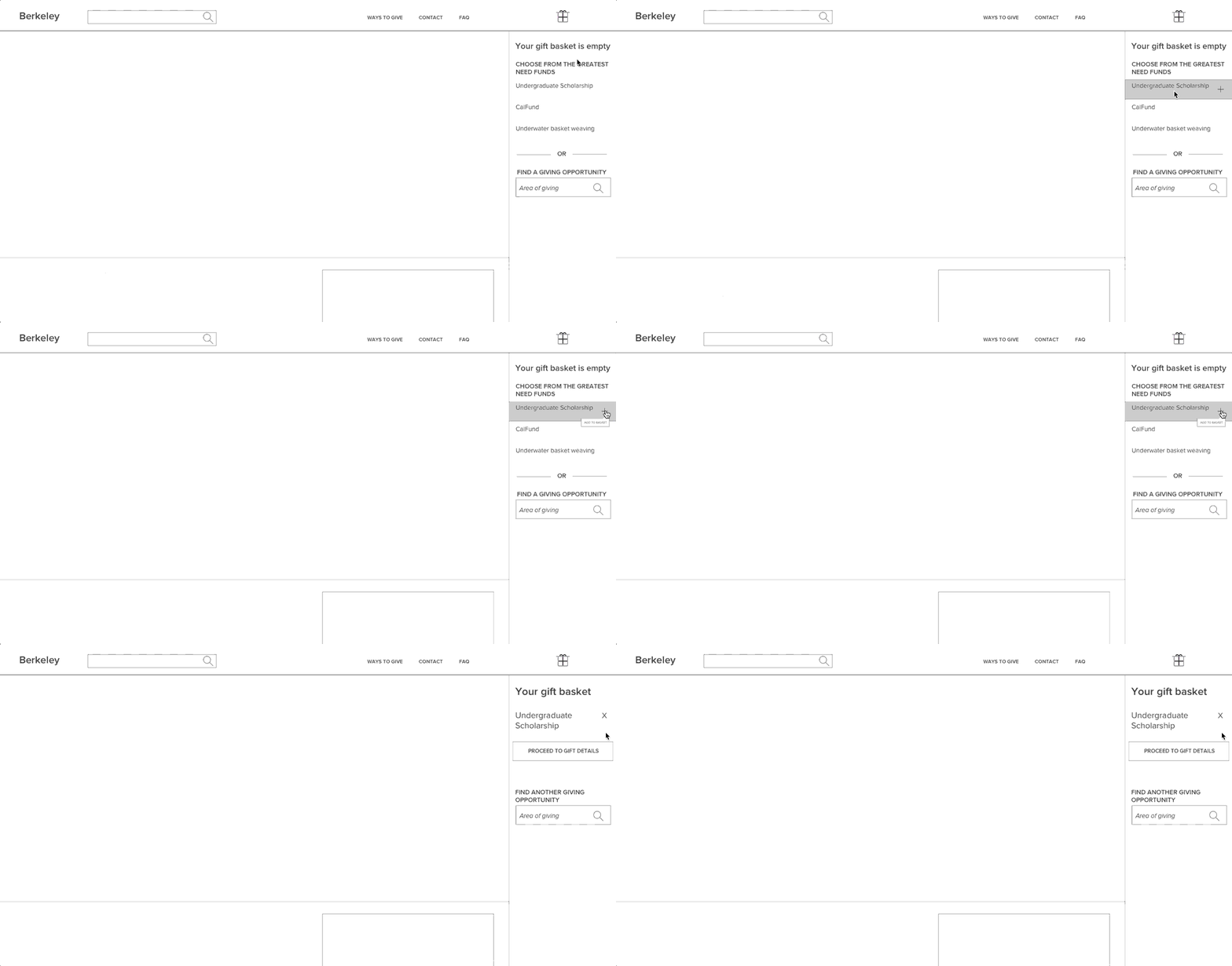
This permanently open sidebar is the last option I am exploring. Its advantage is that it eliminates the need for a click to reveal the your basket’s content. The disadvantage is in the fact that, again, the space is pretty narrow.
Proceeding with the gift
Once the user adds funds to their gift basket and proceeds to the next step, the Gift Details page, there are a couple of key decisions that they need to complete.
Gift summary
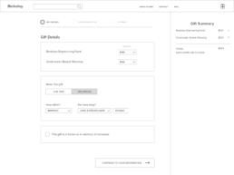
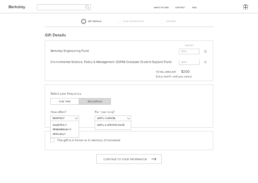
I initially wanted to have a summary in the sidebar that would be visible throughout the “checkout” process. However, after discussing this treatment, we decided to move away from the sidebar and instead move the summary right underneath the amount selection, a la a total tally.
Gift types
There are three different types of gifts that the donors can make: one-time, recurring, and a pledge. The latter means that the donor signs up to give for a set period of time starting from now. While this is the way our gift processing department works, users have expressed their confusion about this concept.

I am proposing to simplify this by only having two options: one-time and recurring. Within the recurring gift, the donors would be able to either make this an ongoing gift or to set the end date for it. By setting the end date, their gift is automatically categorized as a “pledge” on our side.
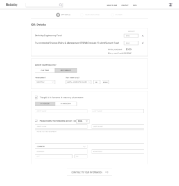
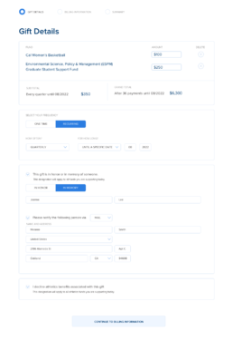
Here is what the Gift details page looks like with all of the fields revealed.
User testing
Before moving on to the next design phase, I wanted to test our assumptions with real users. I prepared task lists and screen flows. I was able to get a great mix of people: existing and new donors, parents, alumni and students.
Some interesting findings were:
- Main Search bar is not prominent enough
- People preferred the sidebar treatment for the gift basket
- People are confused about the difference between the FAQ vs Contact vs Ways to Give pages
As the result of this testing, I was able to adjust the designs to better reflect the needs of the users.
UI Design
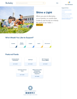
I wanted to make the page feel light and airy, so I am using lots of white space and small pops of color. I am also introducing a curved crop for the hero image as a way to add a more organic feel to the page. I am repeating this motif in the cards below.
Based on the user feedback, I have merged what previously lived in 3 different pages (Ways to give, FAQ, and Contact) into one unified FAQ page.
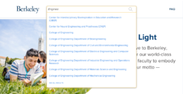
Dynamic search results in the header
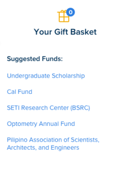
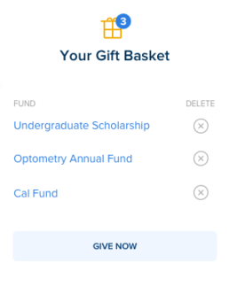
Gift basket counter changes to reflect the number of funds in the basket. We are also changing the language of the button from the lengthly “Proceed to gift details” to a more action-driven “Give now”
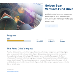
We are introducing a new type of page — a fund drive, where fund managers can set up time and dollar amount goals. The users then would see the progress toward the goal.
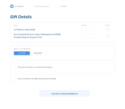
Once the user proceeds with the giving flow, they are able to enter the amount per fund. The default frequency is set to a one time gift. If there is an athletics-related fund in the gift basket, the last section (“I decline athletic benefits associated with this gift”) appears.
If the frequency is changed to Recurring, we calculate and display sub total and grand total values.
The result
I am proud of the positive impact that I had on the donor experience at this scale as the entire institution’s gift giving goes through this portal. I am also grateful to have worked with amazingly-talented folks.
Other Case Studies
