Valimail
The challenge
Valimail is a SaaS startup in the email security field. I was brought on as Senior Product Designer. The design team was very small, just me and the Design Director. I was assigned to one of the development groups that was working on Enforce, Valimail’s enterprise solution.
While I was mostly working on the enterprise product, I was also actively involved in building up the design system. The product was going through a big transition, both architecturally and visually. For the design portion, it meant that we needed to start with a good design system structure, which would later allow us and the engineers to work more efficiently.
In addition, I also got to work on branding and illustrations for the product line.
Team
Designer (me), backend and frontend engineers, product manager
Scope
IA, wireframing, task flows, pitching solutions to stakeholders, conducting user testing, product design, ensuring correct design implementation
Tools
Pen and paper, Figma, HTML, CSS
Authentication Status
The main screen that users see for a given domain is what is called an authentication status. It shows them the stats on what happens with the emails sent from that domain over the past week.
Based on user research and analytics, it was clear that people experience difficulty understanding the data that they are presented with when they just sign up for service. This means that they do not come back after that first visit to the app. To help me understand the problem, I participated in user interviews and also asked my colleagues from the customer success team to walk me through the process of getting a domain to enforcement. Turns out, it is a very complex endeavor and the product does not make it any less confusing at the moment.
Taking an inventory of the current state
First step was to document the current state of the product to help me understand how things are wired up. I wrote down all of the items on each page. There is a lot of information here.
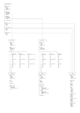
I made wireframes of the current state to better understand how the data is presented.
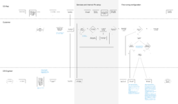
I also documented task flows, which was really helpful in finding certain repetitive tasks that the customers had to perform during the initial setup.
Finding a shared vocabulary
During my interviews with the customer success team, I kept hearing one word that stood out to me. That word is “authorized sender”. When I asked what it is, it was so easy to understand: either a sender is authorized by you (the organization), or it is not. The goal is to only allow authorized senders to send emails on your behalf.
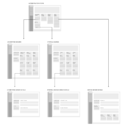
I am proposing to use this notion of authorized and unauthorized senders throughout the application.
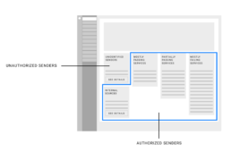
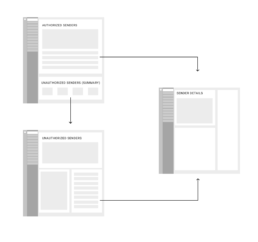
I am also advocating for reducing the number of unique screens to 3: Authorized Senders, Unauthorized Senders, and Sender Details. Authorized Senders would be the main entry point for the user.
Design library
A big part of my responsibilities was updating the design library. New additions would be a part of sprints and I would prepare fully-specked designs to hand over to the developers.
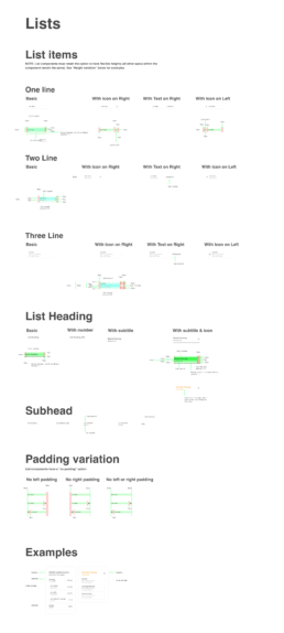
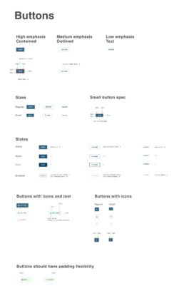
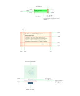
Here is a close-up of the format that the specs were in. I would work directly with developers to iron out questions and make sure that they had everything they needed to proceed.
Suite Branding
During my time with Valimail, the business has changed its strategic focus. Valimail was going to be marketed as a suite, bringing together 4 different products under one umbrella. I explored various options for the visual treatment of the suite. With all of these ideas, I wanted to give the product more of a personality and in doing so make it more approachable and friendly, especially since we wanted to start marketing the products to smaller businesses, which do not necessarily need to have all the enterprise-level complexities. I wanted that to be reflected in the suite’s identity.
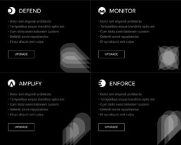
The products in the suite are: Enforce, Defend, Amplify, and Monitor.
Initial exploration
I looked into various options from monograms to shapes.


Final proposal
While the products will be marketed to smaller businesses, I was weary of making it overly friendly to the point where the brand loses its seriousness. I stuck with stripping down the color to only black and white and bringing in the playfulness and the character through the rounded letterforms in the monogram. Their roundness is complimented by the marks that are more angular, creating a nice balance.
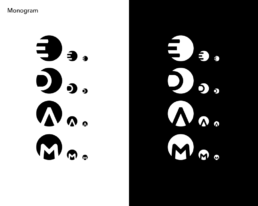
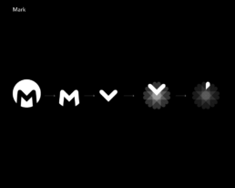
Taking the basic shape derived from the monogram, I want to also add a mark for each product. The mark needs to convey the essence of the product. For example, for Monitor, where the main feature is to keep an eye on your domain’s activity, I am using the shape in a way that evokes the notion of a searchlight. With Defend, I am creating a sense of protection. With Amplify, I am using the shape as a visual metaphor for magnification. With Enforce, it is to give a sense of security.

The marks could be used in tandem with the monograms as a background element.
Illustrations
I made various illustrations for empty states, as well as for plan upgrading options. Prior to my arrival, there were no illustrations in the product, so I wanted to set one main theme for the style. I chose space as the theme to demonstrate that Valimail helps you explore the vastness of email security, while simplifying its complexities.

The result
I am proud of the impact that I had on Valimail’s product. It now has a more understandable and friendly interface.
I gained valuable skills of teaming up with PMs, cross-departmental collaboration, as well as building up a design library from the ground up.
Other Case Studies
Product and visual design for a B2B2C health insurance platform
Redesigning the giving experience for University of California, Berkeley
New product features and flows for a SaaS-based revenue-optimization platform
iOS and Android app design for a transportation startup
